
See how I helped transform clunky MVPs and engineer-led tools into polished, intuitive, user-centred products.
Drawing on my experience in product and UX design, I helped the team turn complex requirements and emerging market trends into a scalable, world-class SaaS platform that is both powerful and effortless to use.
UX designs with end-to-end product design strategies
UX designs with end-to-end product design strategies
Effortlessly manage your investments, adjust your target retirement date, and rebalance your savings allocations in real-time—giving you the flexibility and confidence to plan for the life you want.
Your pension, on your terms

Effortlessly manage your investments, adjust your target retirement date, and rebalance your savings allocations in real-time—giving you the flexibility and confidence to plan for the life you want.
Your pension, on your terms
First step
"Maintaining layout familiarity" → Rephrased to emphasize preserving or respecting the existing user workflow, which is crucial for complex tools.
"Applying visual structure" → Refined to "streamlining page hierarchies" or "standardizing," which sounds more professional.
"Making... easier to read and reuse" → Upgraded to "optimizing data visualization" or "refining how users interact with complex data," which highlights your UX expertise.
"Proving the concept" → Strengthened to "validating our approach" or "demonstrating viability."
First step
Why change?
This private pension provider spent 20 years building a foundation of financial security for it's members. But while the pension policies are rock-solid, their digital gateway was becoming a relic.
The existing portal—responsible for managing retirement dates, fund allocations, and claims—was a bottleneck. It was built for the legacy systems of the past, not the mobile-first, self-service expectations of today. The result? A confusing experience that kept members at arm's length from their own retirement goals.
But while the engine under the hood remained powerful, the user experience had stalled. Visually and structurally, the platform felt like a relic from a decade ago. It had grown organically rather than strategically, resulting in a fractured experience.
Key improvements
"Maintaining layout familiarity" → Rephrased to emphasize preserving or respecting the existing user workflow, which is crucial for complex tools.
"Applying visual structure" → Refined to "streamlining page hierarchies" or "standardizing," which sounds more professional.
"Making... easier to read and reuse" → Upgraded to "optimizing data visualization" or "refining how users interact with complex data," which highlights your UX expertise.
"Proving the concept" → Strengthened to "validating our approach" or "demonstrating viability."
This private pension provider spent 20 years building a foundation of financial security for it's members. But while the pension policies are rock-solid, their digital gateway was becoming a relic.
The existing portal—responsible for managing retirement dates, fund allocations, and claims—was a bottleneck. It was built for the legacy systems of the past, not the mobile-first, self-service expectations of today. The result? A confusing experience that kept members at arm's length from their own retirement goals.
But while the engine under the hood remained powerful, the user experience had stalled. Visually and structurally, the platform felt like a relic from a decade ago. It had grown organically rather than strategically, resulting in a fractured experience.
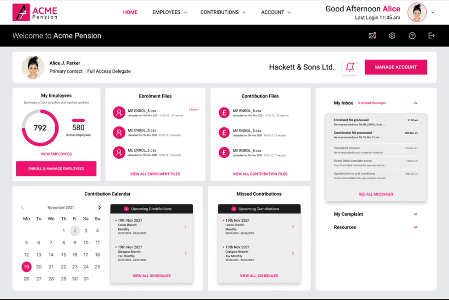
Polished mockup
Polished mockup
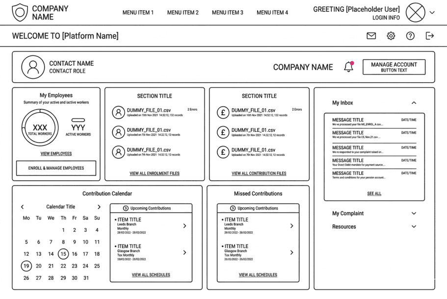
Initial wireframe
Initial wireframe
By redesigning few components, we demonstrated how a small change could streamline development and bring visual consistency across the entire product.
Here's what followed:
Rebuilt the Employer payroll processing first - being the crux of the overall pension processing, it was a crucial part in the machinery to be addressed and streamlined first.
Build logic for legacy members to migrate - Pension client had over 3 million pensioners which needed to move to new system without registration.
Create a new brand identity which resonates with clients' business values
Clustering redesigned.


"Transformation starts today"
Available for fixed term contract, and full time work
"Transformation starts today"
Available for fixed term contract, and full time work
"Empathy isn't about talking; it's about connecting."
"Transformation starts today"
Available now for fixed term contract, and full time work